What a journey! The logo has been a source of much frustration for the team for a while. Trying to find a combination between unique and simple is always a struggle. At the start of the summer we decided to give this work a chunk of time and spend time chiselling away at it to discover something that would look beautiful and feel natural.
This work started off with a mind-map of associations that the team had with Suvera. We dove into definitions and associations, and landed on 3 main concepts that we decided to explore even further.
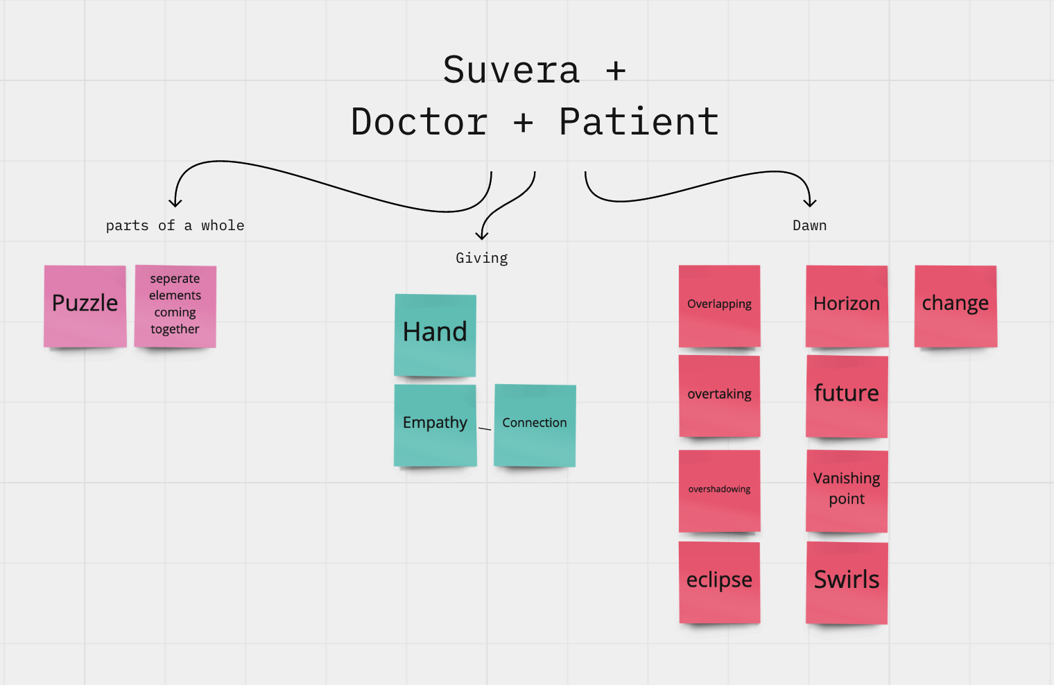
Based on the associations, we put together a Pinterest board of images that embodied some of these concepts visually. We found clear patterns in some of the images we were pinning and found the strongest visual associations with horizons, empathy and eclipses.
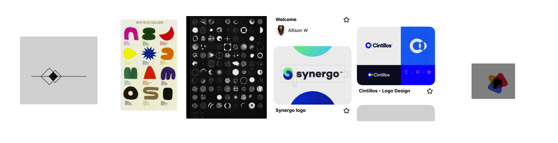
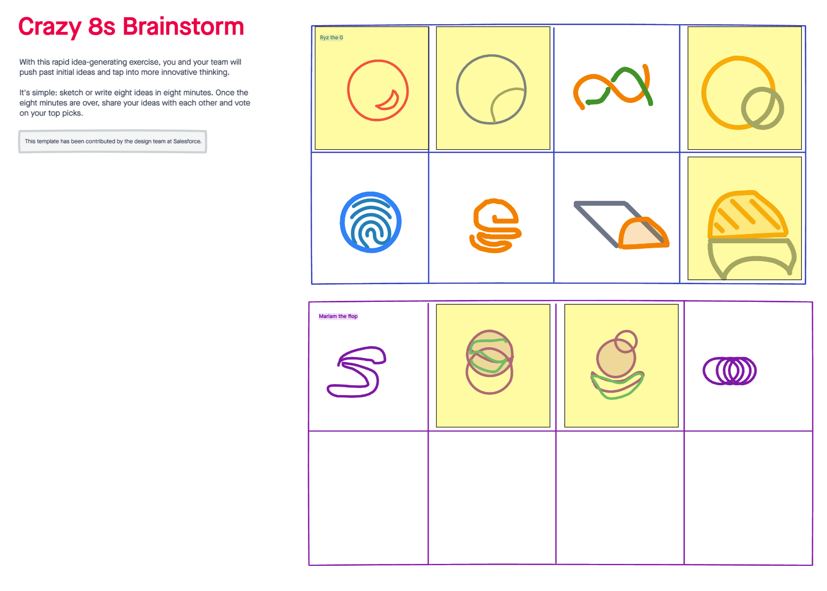
With these visual associations in mind, we moved forward to a Crazy 8s brainstorm. This is where we have one minute to adapt each sketch, and had to move on. We wanted to see if there were any overlapping themes that we could take to the next stage. We found that we both used circles and overlapping shapes.
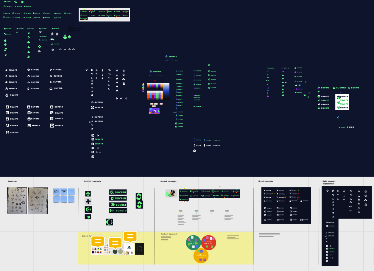
We went through many variations of the design. We went through each process of iteration with feedback and suggestions from the team. The strongest concepts from each iteration were grouped together and voted and improved upon.
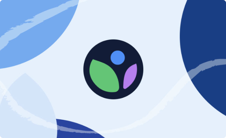
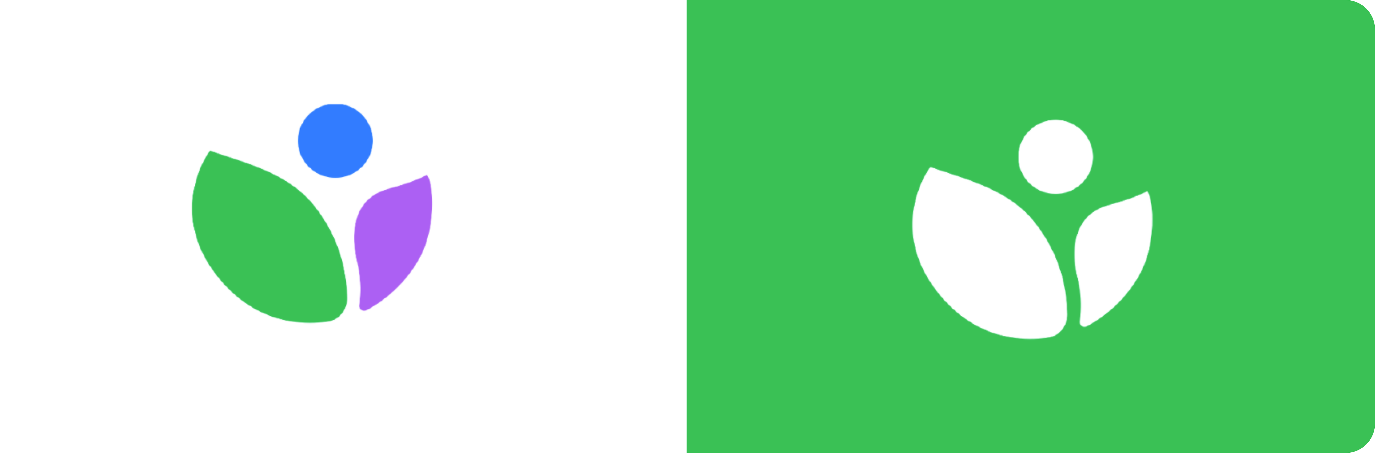
Our final logo was designed to represent a crucial part of Suvera's identity. The green and purple leaves represent the the current healthcare system, together with a community of patients. The blue circle is a form that rises from the open arms of a flower, representing Suvera as a new entity of change. All three are part of a whole. Suvera's mission is to accelerate the move from reactive to proactive healthcare, while delivering a service that keeps people in good health.

.png)